
Visual Hierarchy: 8 Tips to Boost Conversions
Visual hierarchy is a design strategy that helps guide users' attention to key elements on a webpage, improving user experience and increasing conversions. It uses size, color, contrast, alignment, and typography to prioritize content and actions. Here’s how you can apply it:
- Position Key Information: Place CTAs and important content where users naturally look, like the top-left or center of the page.
- Size and Scale: Make critical elements larger to draw attention.
- Color and Contrast: Use high-contrast colors for CTAs and maintain a clean, focused color palette.
- Typography: Use bold, clear fonts for headings and CTAs to improve readability.
- Simplify Design: Remove unnecessary elements and use whitespace to reduce clutter.
- Test and Refine: Use tools like A/B testing and heatmaps to optimize designs.
- Mobile Optimization: Ensure designs are user-friendly on smaller screens.
- Consistency: Maintain uniform styles across all pages to build trust.
How To Increase Conversions With Design
Key Elements of Visual Hierarchy
In web design, size, color, contrast, and typography are essential for creating a clear visual hierarchy. These elements work together to guide users' attention and direct them toward desired actions or conversion goals.
Size and Scale
Using size strategically can make key elements, like CTAs (Call-to-Actions) or value propositions, stand out. Larger elements naturally draw the eye, signaling importance and encouraging interaction. Smaller elements, meanwhile, serve as supporting details, helping create a clear path for users to follow.
Color and Contrast
Color and contrast are powerful tools for directing attention. High contrast can highlight important features, like CTAs, while thoughtful color choices can evoke emotions and strengthen your branding.
Here are some quick tips:
- Use high contrast to make CTAs pop.
- Stick to a limited color palette to keep designs clean and focused.
- Ensure text has strong contrast against its background for better readability.
Typography
Typography is key to organizing content and improving readability. Elements like font size, weight, and style help establish a clear content structure, making it easier for users to scan and engage with your site.
| Typography Element | Purpose | Impact on Conversions |
|---|---|---|
| Font Size | Highlights key info | Draws attention to priorities |
| Font Weight | Creates hierarchy | Guides reading flow |
| Font Style | Differentiates sections | Improves readability |
8 Tips to Improve Conversions with Visual Hierarchy
1. Position Key Information
Place crucial details, such as your value proposition and main call-to-action (CTA), in areas where users are most likely to look first. Research shows users often follow an 'F' pattern when scanning content.
2. Use Size and Scale Effectively
Make important elements stand out by increasing their size. For example, your main CTA button should be noticeably larger than surrounding elements to grab attention.
3. Apply Color and Contrast
Use high-contrast colors to make CTAs stand out while ensuring they align with your brand identity. Secondary actions can use complementary colors that don’t overpower the design.
| Element | Color Strategy | Purpose |
|---|---|---|
| Primary CTA | High contrast, brand colors | Draw immediate attention |
| Background | Neutral, subtle tones | Minimize distractions |
4. Choose Clear Typography
Focus on readability by using bold fonts for CTAs and clean, easy-to-read typography for body text. This helps users quickly identify key actions.
5. Simplify the Design
Reduce clutter by removing unnecessary elements and focusing on what’s essential. Use white space strategically to highlight important actions and reinforce the visual hierarchy created by size, color, and typography.
6. Test and Refine
Tools like heatmaps and A/B testing can provide insights into user behavior. Use this data to tweak your design and improve conversion rates.
7. Optimize for Mobile
Ensure your design works seamlessly on mobile devices. Key elements like CTAs should be visible without scrolling, and font sizes, button dimensions, and spacing should be adjusted for smaller screens.
8. Ensure Design Consistency
Keep visual patterns consistent across your site to make navigation intuitive and build trust. For example, use the same styling for buttons, headers, and other elements on every page.
sbb-itb-3623b4a
Common Mistakes in Visual Hierarchy
Getting visual hierarchy right can improve conversions, but common missteps can hurt your efforts and push users away from taking action.
Complex Designs
Overcrowded designs overwhelm users and dilute the impact of key elements. Research shows that simplifying a webpage by removing unnecessary components can increase conversions by up to 25%.
| Problem | Effect on Conversions | Fix |
|---|---|---|
| Too Much Clutter | Overloads users, causing drop-offs | Eliminate unneeded elements |
| Too Many Choices | Lowers click-through rates | Focus on 1-2 main actions per page |
| Poor Element Order | Weakens conversion rates | Establish a clear visual order |
Neglecting Mobile Optimization
Mobile users engage differently, so designs must account for smaller screens. Issues like tiny buttons, hard-to-read text, or hidden calls-to-action (CTAs) frustrate users, leading to fewer conversions. Make sure essential elements are easy to tap, clearly visible, and properly spaced for mobile devices.
Inconsistent Design
Inconsistent visuals - like mismatched buttons, varying fonts, or shifting layouts - force users to adapt repeatedly. This not only distracts them but also erodes trust. Keeping your design consistent across the board builds familiarity and encourages users to follow through on their actions.
Avoiding these pitfalls is key, but using the right strategies and tools can take your visual hierarchy to the next level and improve conversions.
Tools for Improving Visual Hierarchy
Understanding visual hierarchy is crucial, but the right tools can help you apply it more effectively and efficiently. These tools simplify the design process while maintaining top-notch quality.
Text to Infographic
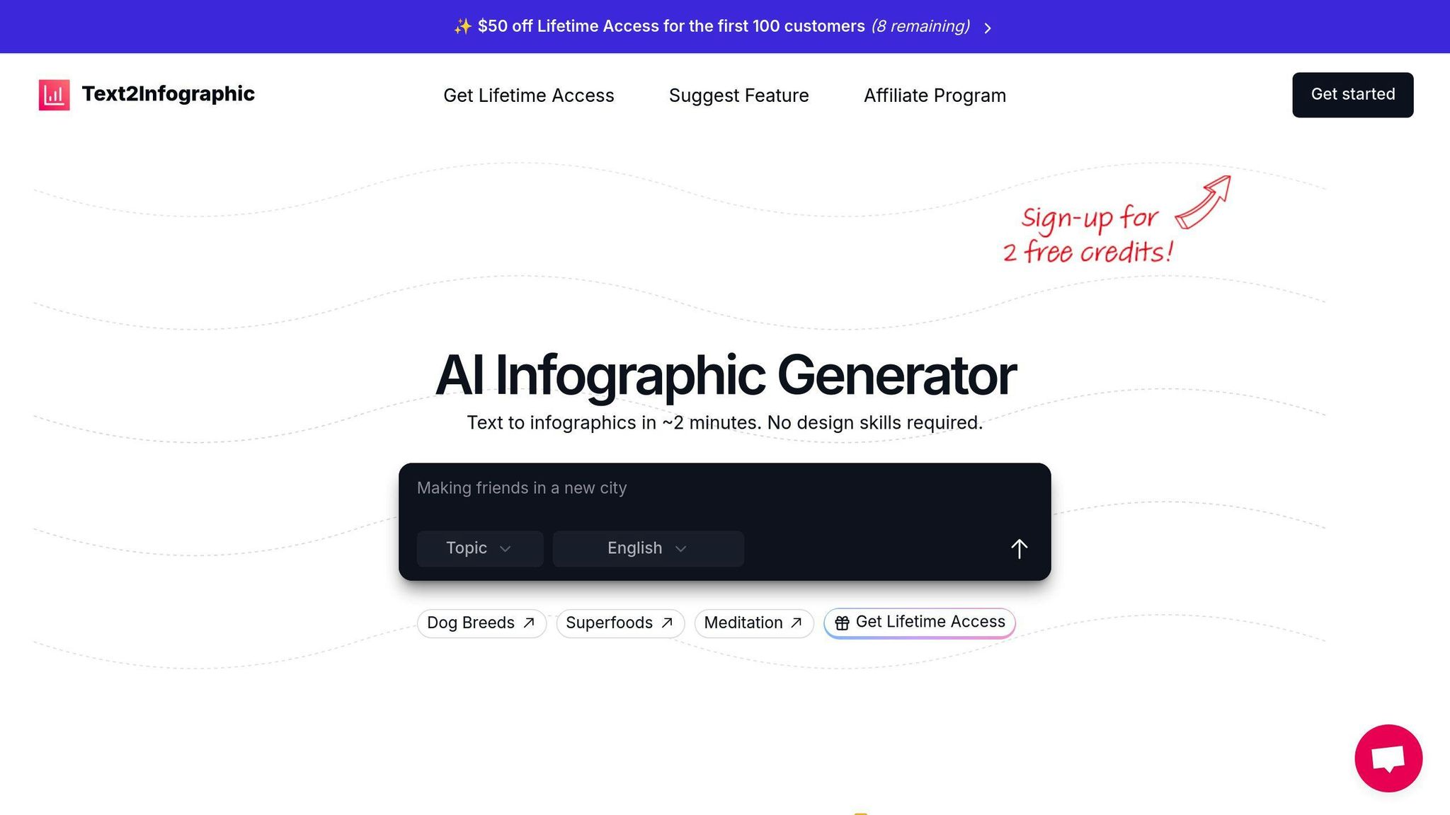
This AI-driven tool helps transform plain text into visually engaging infographics. It’s designed to create clear, structured designs that emphasize key points, making it a great choice for marketers, content creators, and business owners.
| Feature | How It Helps Visual Hierarchy |
|---|---|
| AI-Powered Automation | Highlights and organizes content effectively |
| Customization Options | Ensures designs match your branding |
| Multi-language Support | Keeps hierarchy consistent across languages |
| Mobile-Optimized Output | Delivers clarity on screens of all sizes |
Here’s how you can make the most of Text to Infographic:
- Organize Your Content: Start by inputting clear, concise text and choose templates that focus on essential points.
- Keep It On-Brand: Make sure your designs align with your brand’s colors, fonts, and style.
- Think Mobile: Double-check that your infographics look sharp and easy to follow on smaller screens.
The tool automates the process of emphasizing key details, creating a logical flow that’s easy for users to follow. This helps make your information more digestible and encourages action, aligning perfectly with your conversion goals.
Conclusion: Key Points for Boosting Conversions
Recap of Tips
Visual hierarchy plays a crucial role in effective web design, shaping how users interact with content and make decisions. The eight strategies we've covered - like positioning key details, leveraging size and scale, and using color and contrast - work together to create a smooth user experience. These methods help guide attention and make decision-making easier, ultimately improving conversions.
Now, let’s focus on practical steps to apply and refine these techniques for lasting results.
Practical Advice
To make the most of visual hierarchy and boost your conversion rates:
- Start Small: Begin with one or two tweaks, such as adjusting where your CTA is placed or fine-tuning your typography. Measure the results using tools like A/B testing or heatmaps.
- Design with User Behavior in Mind: Structure your visuals to align with how people naturally scan and absorb information.
- Leverage Useful Tools: Use tools like Text to Infographic to create visually engaging and well-organized content.
- Stay Flexible: Continuously update and refine your designs to keep up with changing user preferences.