30 Inspiring Color Palettes for Marketing Infographics
Table of Contents
- Understanding Color Theory in Infographic Design
- Choosing the Right Colors for Your Infographic
- Quick Tips for Easy-to-Use Infographic Color Palettes
- 30 Color Palettes for Marketing Infographics
- Additional Design Tips for Creating Impactful Infographics
1. Understanding Color Theory in Infographic Design
Creating a visually engaging infographic starts with knowing how colors can work together to communicate your message. Colors do so much more than make things look nice—they guide attention, evoke emotions, and can even impact decision-making. For content creators, marketers, or small business owners looking to make a professional impression, learning a few basics of color theory can make your infographics resonate with your audience. In this section, we’ll break down why color theory is a game-changer for infographic design techniques, go over some core concepts, and show you how to apply color theory in ways that are easy and impactful.
1.1 Why Color Theory Matters for Infographics
When you’re putting an infographic together, it’s natural to zero in on the information you’re presenting. But if you want that information to stand out, choosing the right colors is just as important as the content itself. Here’s why color theory matters:
- Enhanced Readability: Well-chosen colors can make an infographic easier to read and understand. For example, pairing dark text with a light background improves readability, while using contrasting colors for different sections keeps the focus on what matters most.
- Emotional Impact: Colors can stir emotions, which makes it easier to connect with your audience. For instance, blue often conveys trust and professionalism, while yellow feels energetic and optimistic. By understanding these associations, you can choose colors that align with your message's mood.
- Guiding Viewer Focus: Color is a great tool for highlighting key points and guiding the viewer’s eye through your infographic. By using different shades or tones, you can direct attention to the most important elements, ensuring your message doesn’t get lost.
Whether you’re trying to create a calming educational infographic or an attention-grabbing visual for marketing, applying color theory can make all the difference in how effectively your infographic communicates.
Related Video
Watch this video to learn more about color theory.
1.2 How to Use Color Theory in Infographic Design
Now that we’ve covered why color is important, let’s get into how to use color theory to make better design choices. Even if you’re not a designer, a few basics can help you pick colors with confidence.
The Color Wheel: Your Starting Point
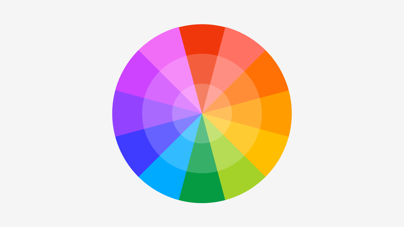
At the center of color theory is the color wheel, a tool that shows the relationships between colors. You’ve got your primary colors (red, blue, yellow), which form the foundation. Mix these, and you get secondary colors (green, orange, purple). Add in mixes of primary and secondary, and you’ve got tertiary colors to round out the wheel. Understanding the color wheel gives you a roadmap to creating cohesive color schemes for your infographics.
Color Schemes to Elevate Your Infographic
Several classic color schemes can make your infographic feel balanced and visually appealing:
- Complementary Colors: These are colors directly opposite each other on the color wheel (like blue and orange). Complementary schemes create strong contrast, making them ideal for highlighting key points.
- Analogous Colors: These colors sit next to each other on the wheel (like blue, green, and teal). Analogous schemes have a natural harmony and are often found in nature. They’re perfect for educational content or infographics where you want a gentle flow of information without harsh contrasts.
- Triadic Colors: This scheme uses three colors spaced evenly around the wheel (such as red, yellow, and blue). Triadic colors create a vibrant, balanced look that brings energy to an infographic, ideal for engaging topics.
- Monochromatic Colors: This scheme involves using different shades, tones, or tints of a single color. Monochromatic palettes are clean and minimalistic, which keeps the focus on the content without distracting the viewer.
By picking the right color scheme, you ensure that each part of your infographic contributes to a cohesive design that draws in your audience without overwhelming them.
The Psychology of Colors: Connecting with Your Audience
Colors can evoke specific emotions, and understanding this psychology adds another layer to your infographic’s effectiveness. Different colors have different associations, so aligning your palette with your message helps create a stronger connection with your audience. Here are a few popular colors and what they tend to convey:
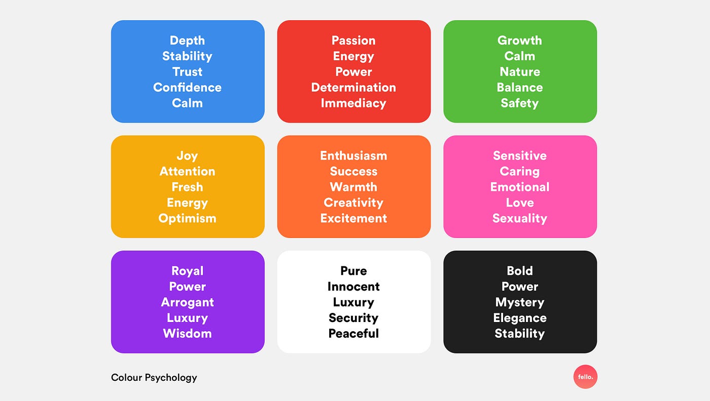
- Blue: Trust, calm, and professionalism. Blue is often used in business and tech-focused infographics to establish credibility.
- Red: Urgency, energy, and passion. Red is great for drawing attention to calls-to-action or important data points.
- Yellow: Optimism, warmth, and positivity. Yellow grabs attention without being too intense and works well for topics that need a friendly tone.
- Green: Growth, balance, and eco-consciousness. Green is a popular choice for infographics related to health, environment, or finance.
- Purple: Creativity, luxury, and wisdom. Purple adds a sophisticated edge, making it a solid choice for infographics in design, art, or lifestyle topics.
When designing your infographic, think about the message you want to communicate and choose colors that enhance that message. This approach makes your content more memorable and relatable.
Tips for Applying Color Theory to Infographics
Here are a few practical tips on using these color principles to create easy-to-use infographic color palettes:
- Limit Your Palette: Too many colors can be distracting. Stick to 2-4 colors for most infographics. Using a limited color palette also makes it easier to achieve a cohesive look.
- Use Accent Colors Sparingly: Accent colors are great for drawing attention to specific data points or sections. But overdoing it can overwhelm viewers. Choose one accent color and use it strategically to guide the reader’s attention.
- Balance Bright and Neutral Colors: Bright colors catch the eye, but they can be intense when overused. Balance them out with neutrals (like gray or beige) to give your design breathing room and improve readability.
- Test for Contrast: Make sure there’s enough contrast between your text and background colors. This not only improves readability but also keeps your message clear. Dark text on a light background (or the other way around) is often best.
- Adapt Colors to Your Brand: If you’re creating an infographic for your business, start with your brand’s primary color(s). Build the rest of your palette around these to keep the design consistent with your overall branding.
Using color theory doesn’t mean you need to be a designer. With these basic principles, you can make choices that elevate your infographics without spending hours on color selection.
By following these color theory fundamentals, you’ll be able to create an infographic color palette that not only looks professional but also enhances your message. In the next section, we’ll dive into practical steps for choosing colors that suit your specific content, keep your target audience engaged, and achieve a polished look that aligns with your goals.
2. Choosing the Right Colors for Your Infographic
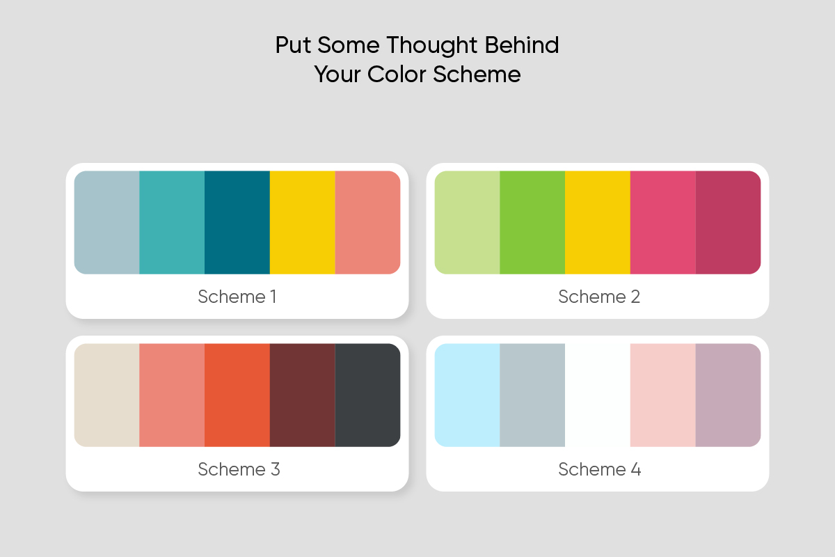
Selecting the perfect colors for your infographic is more than just picking shades that look appealing. It’s about making thoughtful choices that reinforce your message, fit your brand, and engage your audience effectively. In this section, we’ll walk through key factors to consider when choosing colors, explore how to align them with your infographic’s purpose, and share tips for selecting the best background combinations for readability.
2.1 How to Choose Colors for Infographics
Choosing colors for an infographic isn’t only about aesthetics; it’s also about creating harmony with your brand, audience, and topic. Here are some essential factors to consider to ensure your color choices enhance your infographic’s purpose.
Brand Colors
Start by incorporating your brand’s colors, especially if your infographic is part of a larger content strategy. Consistency with brand colors builds trust and strengthens your brand identity, making it easier for viewers to recognize your content. Use your primary brand color as the base, then build the rest of the palette around it to keep a unified look.
If your brand has a limited color scheme, you can start with a neutral base (like white, gray, or navy) and add one or two accent colors that capture the essence of your brand. If you’re making multiple infographics, try experimenting with different accent colors for variety while maintaining the core brand look.
Target Audience
Your audience’s preferences play a big role in color selection. Colors have psychological associations that impact how different demographics respond to your content:
- Young Audiences: Bold, bright colors bring energy and vibrancy, which often resonates with younger viewers.
- Professional or Corporate Audiences: Cool colors like blues, grays, and muted tones convey professionalism and trust—qualities important to corporate or professional viewers.
- Health or Eco-conscious Audiences: Greens, blues, and earthy tones speak well to audiences interested in wellness, environmental topics, and sustainability.
The more you understand your audience, the easier it is to choose colors that truly connect with them.
Theme and Topic
The theme and topic of your infographic should also shape your color choices. Different topics lend themselves to different moods, and colors help convey these moods. For example:
- Educational Content: Soft, muted colors like light blues, greens, and pastels work well for educational infographics, creating a calm and inviting feel.
- Data-heavy or Technical Infographics: Bold colors like navy, orange, or dark green can break up dense information and draw attention to key points.
- Sales or Marketing Content: High-energy colors like red, yellow, or bright blue are ideal for grabbing attention and creating a sense of urgency.
Aligning your color choices with the theme of your infographic helps set the right tone and keeps viewers engaged with the content.
Matching Colors with Infographic Purposes
Different colors can serve distinct purposes within an infographic. Understanding how colors interact will guide you in choosing combinations that enhance your content. Here are a few general guidelines:
- Soft Tones for Educational Infographics: Educational content benefits from lighter, softer tones that feel approachable. Shades like pale blue, mint green, and light yellow add a sense of calm that encourages learning.
- Bold Colors for Data-driven Infographics: When infographics focus on data, bold, contrasting colors highlight figures and key points effectively. Colors like black, red, and navy emphasize important details, helping readers focus on the numbers.
- Warm Colors for Inspiring Infographics: If your infographic aims to motivate or inspire, warm colors like orange, yellow, or coral can evoke enthusiasm and positivity, ideal for content meant to encourage action.
Dos and Don’ts of Color Choice in Infographic Design
Here are some practical dos and don’ts to keep in mind for selecting colors in your infographic:
Dos:
- Keep it Simple: Limit your palette to 3-5 colors to avoid visual clutter. Simplicity makes infographics easier to read and helps viewers focus on the message.
- Use High Contrast: High contrast between text and background is crucial for readability. Check that your contrast is strong, especially for key data points or smaller text.
- Consider Color Psychology: Think about the emotions you want to evoke and choose colors that match your message’s mood.
Don’ts:
- Don’t Overdo Bright Colors: While bright colors are attention-grabbing, too many can be overwhelming. Use them sparingly to draw attention to specific points.
- Don’t Ignore Accessibility: Make sure your color choices are accessible to those with color vision deficiencies. Tools like color contrast checkers can help ensure readability.
- Don’t Use Conflicting Colors: Avoid colors that clash or create visual tension. Stick to complementary or analogous color schemes for a harmonious look.
2.2 Best Color Combinations for Infographic Backgrounds
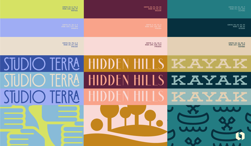
Your background color plays a crucial role in setting the stage for your infographic. A well-chosen background enhances readability, provides contrast, and helps your message stand out. Here are some popular background styles and tips on how to use them effectively.
Light Backgrounds
Light backgrounds are a reliable choice for most infographics. They provide a clean, simple backdrop that keeps the focus on the content itself. Light colors like white, light gray, or beige work well because they don’t compete with the main content. Light backgrounds are especially effective for text-heavy infographics, where readability is key.
Best for: Text-heavy infographics, educational content, and professional topics.
Example Combination: White background with navy text and gold accents. This combination looks professional and visually appealing, perfect for corporate or educational infographics.
Dark Backgrounds
Dark backgrounds add a dramatic flair and can help specific elements pop. They’re great for infographics with minimal text or where you want to highlight graphics or data points. Dark backgrounds, like navy, charcoal, or black, work especially well with lighter text and bright accents.
Best for: Data-driven infographics, tech or entertainment content, and infographics where visuals are the focus.
Example Combination: Dark charcoal background with white text and teal accents. This pairing adds sophistication and makes key data points stand out.
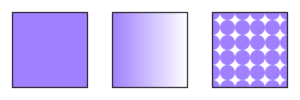
Gradient Backgrounds
Gradients add depth and interest to an infographic without distracting from the content. They can range from subtle color shifts to vibrant transitions. Gradients work well with both light and dark schemes, depending on the tone you want to set. For a modern feel, try gradients that blend shades of the same color.
Best for: Modern, creative topics, and infographics where you want a dynamic, eye-catching look.
Example Combination: Soft blue gradient transitioning from light blue to teal, with dark navy text. This combo has a fresh, contemporary vibe that’s great for creative content.
Patterned Backgrounds
Patterns can bring texture and personality to your infographic but should be used thoughtfully. Simple, subtle patterns like light grids, dots, or soft geometric shapes add visual interest without overwhelming the content. Avoid patterns that are too busy or colorful, as they can distract from the main message.
Best for: Creative or artistic infographics, especially those with minimal text where a touch of texture enhances the design.
Example Combination: Light beige background with a subtle diagonal stripe pattern, navy text, and burnt orange accents. This look has a unique, polished feel that suits creative or lifestyle topics.
Tips for Choosing a Background Color
To ensure your background color enhances your infographic rather than detracts from it, keep these tips in mind:
- Prioritize Contrast: High contrast between the background and text is essential for readability. Dark backgrounds need light text, and vice versa.
- Consider the Mood: Choose a background color that reflects the tone of the infographic. Soft colors work for educational content, while bold colors suit high-energy topics.
- Keep It Simple: When in doubt, go with a plain or lightly patterned background. Complex backgrounds can be distracting, so it’s usually best to keep things simple.
By carefully selecting background colors and prioritizing readability, you can create infographics that are easy to follow and visually engaging. In the next section, we’ll explore 30 inspiring color palettes specifically crafted for infographics. With these options and the guidance in Sections 1 and 2, choosing the right colors for your project will be simpler and more impactful.
3. Quick Tips for Easy-to-Use Infographic Color Palettes
Picking colors for infographics doesn’t have to be overwhelming. Easy-to-use, pre-made color palettes simplify the process and give your designs a polished, professional touch—no design expertise required. In this section, we’ll explain why pre-made palettes are so handy, how to customize them to suit your needs, and some popular resources for finding just the right colors for your next infographic.
3.1 Easy-to-Use Infographic Color Palettes
If you’re a content creator, marketer, or small business owner without a background in design, pre-made color palettes are a game-changer. Here’s why they work so well:
- Time-Saving: With pre-made palettes, you skip the trial and error of color selection. These combinations are carefully curated to look great together, saving you valuable time.
- Consistency: A pre-made palette ensures your infographic looks cohesive, maintaining visual harmony across different elements and sections. This consistency makes your content easier on the eyes and more engaging.
- Professional Finish: Many pre-made palettes are created by designers, giving your infographic a polished and intentional look right off the bat.
Customizing a pre-made palette to fit your infographic is simple. Try adjusting the brightness or saturation of colors to match the mood of your content. For instance, you can tone down colors for educational infographics or add brightness for more dynamic topics. If you’re looking for inspiration, here are some easy-to-use palette types that work well across different infographic styles:
- Educational Palettes: Soft blues, greens, and muted yellows create a calming, welcoming feel, perfect for informational content.
- Corporate Palettes: A base of navy or charcoal with accents of gold or teal conveys professionalism and trust, ideal for corporate or business infographics.
- Creative Palettes: Bold colors like coral, mint, and lavender add energy and make your infographic visually striking, which works well for creative or lifestyle content.
3.2 Tools and Resources for Selecting Color Palettes
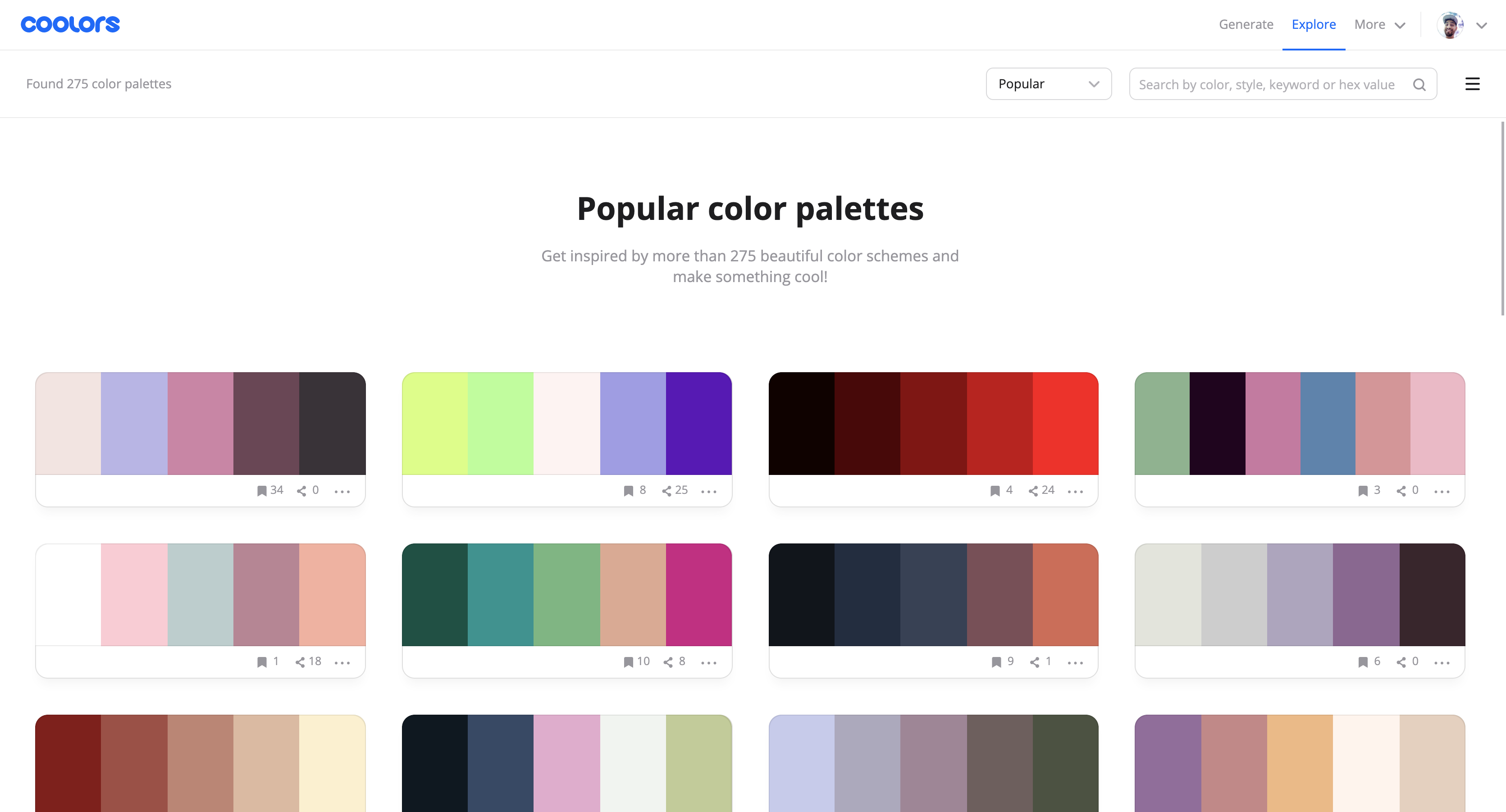
There are plenty of online tools that make it easy to select or customize infographic color palettes. These resources let you experiment with different combinations until you find the perfect fit:
- Adobe Color: Adobe Color allows you to create custom color schemes and offers features like color wheel adjustments, harmony rules, and saving options. It’s a powerful tool for crafting palettes that fit your infographic’s theme.
- Coolors: Known for its simplicity, Coolors lets you generate palettes with a single click, lock in colors, adjust shades, and even export directly to your design tool. Coolors is perfect for quick, no-fuss palette selection.
- Canva Color Palette Generator: Canva’s tool is great for beginners. Simply upload an image (like your brand logo), and Canva extracts colors to create a matching palette. It’s ideal if you want a palette that aligns with your brand colors.
Using these tools takes the guesswork out of color selection, helping you create infographics that look professional and visually appealing. Whether you’re using pre-made palettes or building your own, these resources make it easy to find colors that elevate your visual content.
In the next section, we’ll showcase 30 inspiring color palettes designed specifically for infographics, covering a range of themes and styles to suit any project.
4. 30 Inspiring Color Palettes for Infographics
Finding the right color palette can be a challenge, especially if you’re not a designer. To make things easier, we’ve curated 30 inspiring color palettes specifically for infographics. These palettes cover a range of themes, moods, and styles, making it simple to find one that suits your content. Whether you’re creating an educational infographic, a marketing visual, or a social media post, these color combinations will help you make a professional and visually appealing impression.
1. Canyon Hues
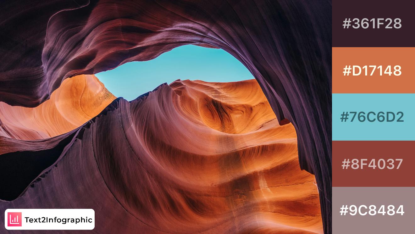
Inspired by the natural beauty of canyon formations, this palette combines rich earthy tones with a refreshing sky blue. The contrast between warm oranges and cool blue provides depth, making it ideal for designs needing a balance between warmth and freshness. These colors can work beautifully in travel or outdoor-themed graphics, enhancing visual interest while remaining accessible.
2. Mountain Sunrise
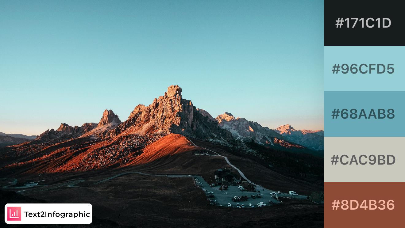
This palette captures the serene beauty of a mountain at sunrise, with earthy browns and muted blues balanced by a gentle sky tone. Ideal for nature-themed branding, these colors evoke calm and resilience. The mix of darker and lighter shades allows for clear visual hierarchy, making this palette versatile for designs where readability and accessibility are key.
3. Winter Forest
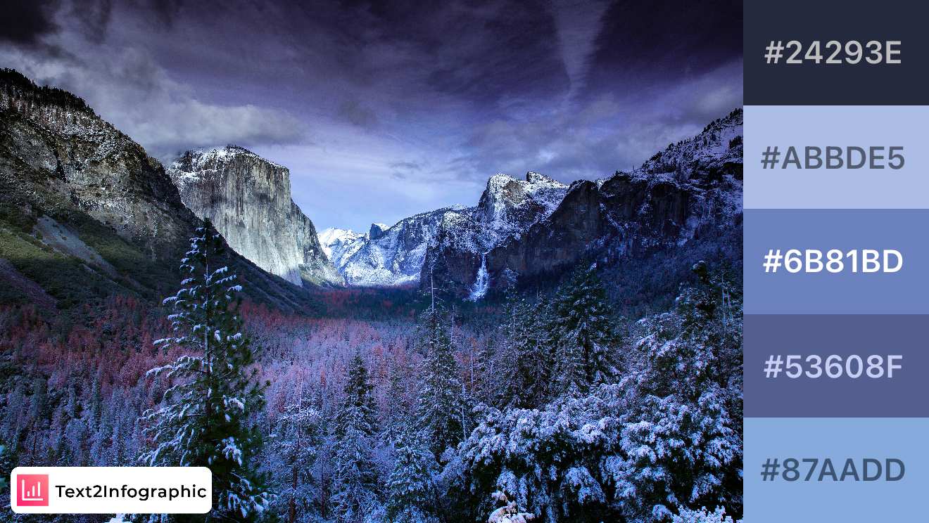
This cool, winter-inspired palette reflects the quiet elegance of a snowy forest. Deep blues and frosty whites create a serene, calming effect, ideal for nature or winter-themed designs. The balance of light and dark shades ensures strong contrast, which can help with readability and accessibility in infographic layouts.
4. Desert Twilight
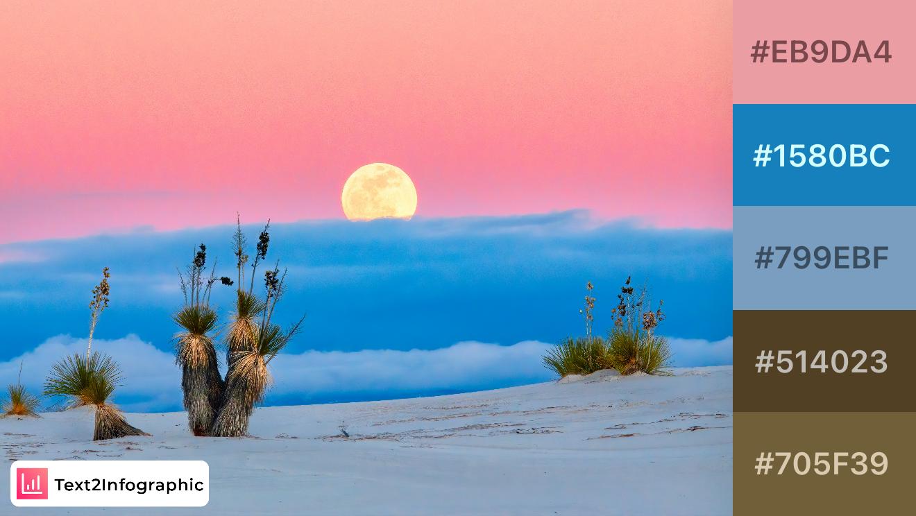
Inspired by the serene beauty of a desert twilight, this palette combines soft pinks and deep blues with earthy browns, reflecting the harmony between sky and sand. Perfect for branding that aims to evoke calm yet bold vibes, these colors can add a touch of tranquility and depth to visual storytelling. The warm and cool tones provide a balanced look, suitable for lifestyle or travel-themed content.
5. Misty Lake
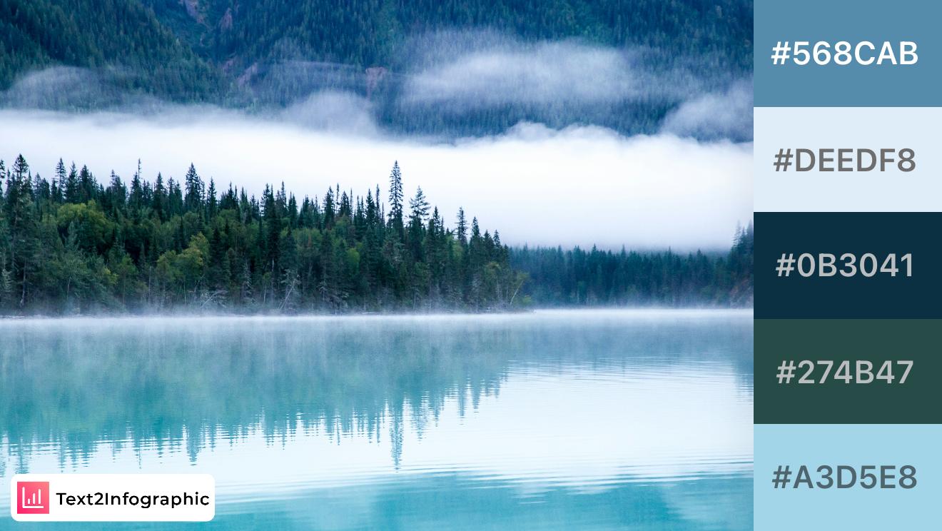
This calming palette captures the serene blues and greens of a misty lake. The deep and muted shades are ideal for projects evoking tranquility and introspection, such as wellness or meditation brands. The blend of cool tones provides a cohesive look that emphasizes relaxation and peacefulness.
6. Lavender Twilight
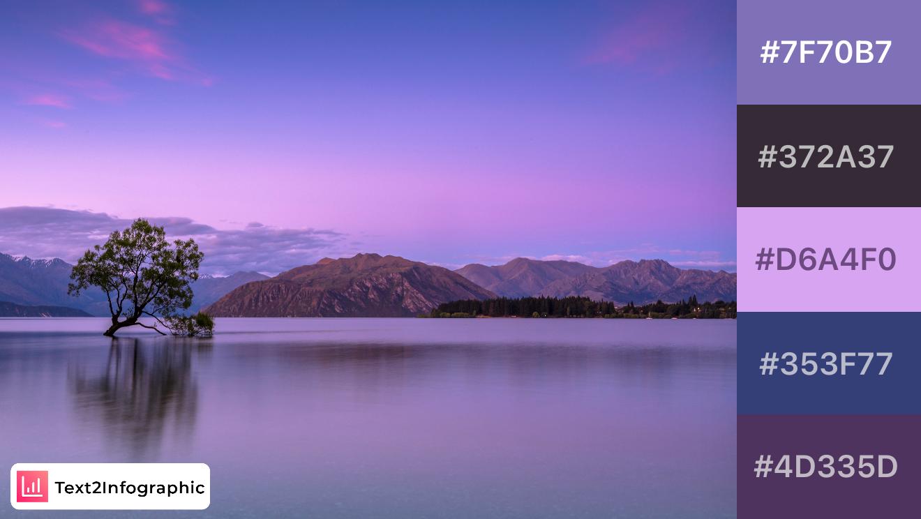
A soothing mix of purples and blues, this palette is inspired by twilight over serene waters. Ideal for luxury or wellness branding, the soft, elegant shades evoke relaxation and sophistication, making it suitable for designs focused on calm and beauty.
7. Emerald Hills
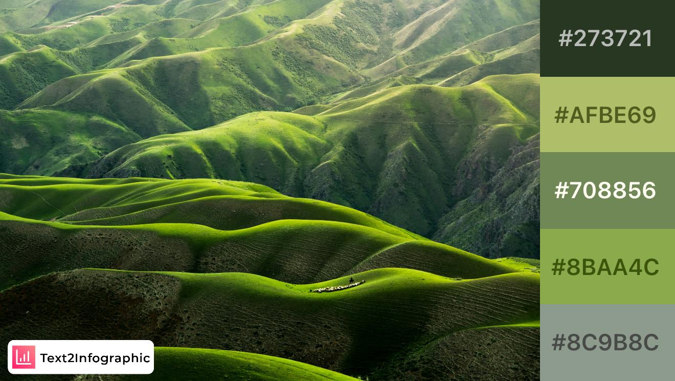
Inspired by rolling green hills, this palette combines deep and vibrant greens for a refreshing, natural look. Perfect for agricultural or environmental projects, the palette captures the essence of lush landscapes and growth, making it ideal for sustainability-focused branding.
8. Verdant Valley
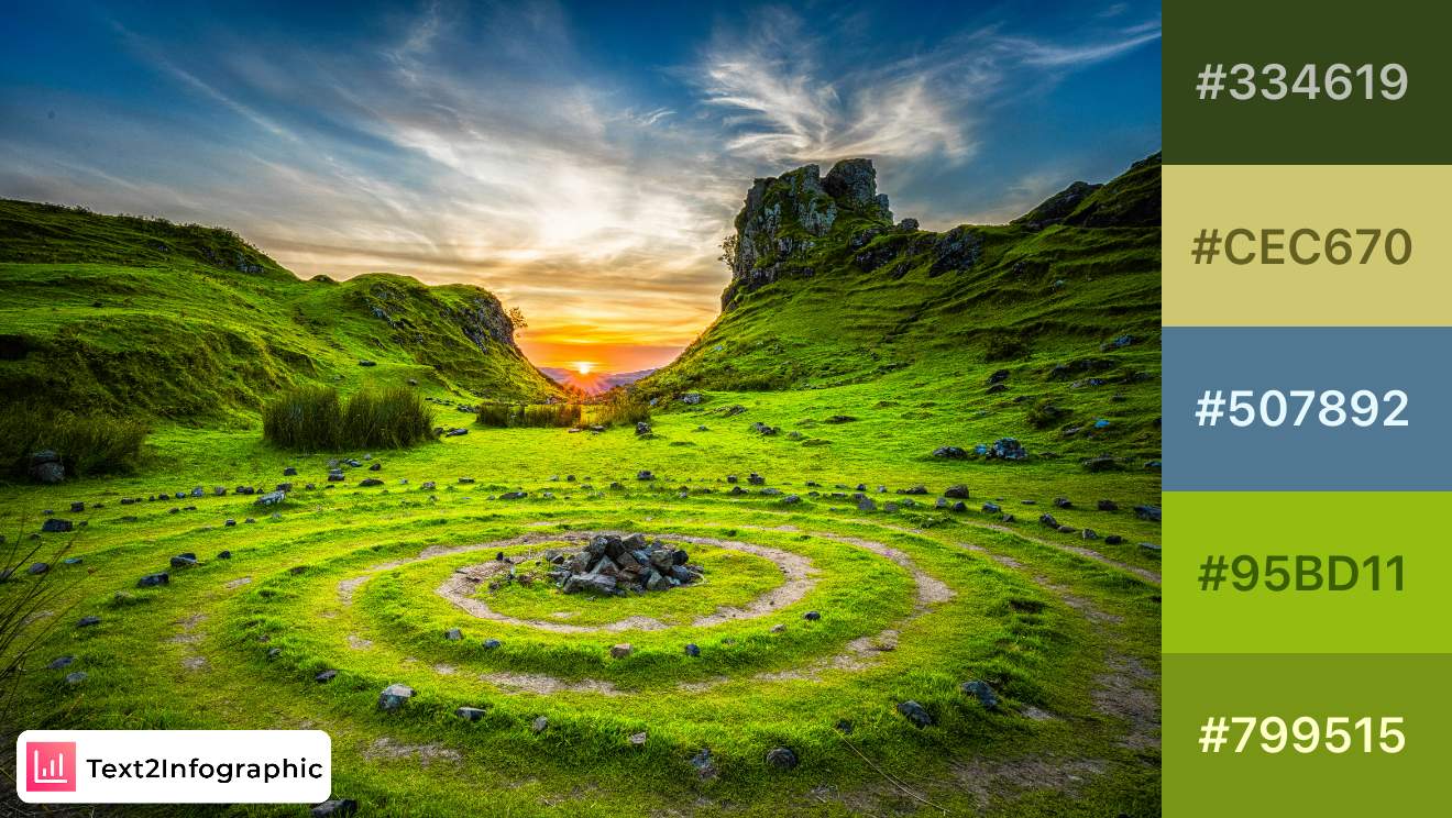
This lush palette draws from the vibrant greens and earthy tones of a valley at sunset. Ideal for eco-friendly or adventure brands, the mix of greens with a touch of blue adds freshness, symbolizing growth and renewal. Perfect for visuals aimed at inspiring outdoor exploration.
9. Desert Glow
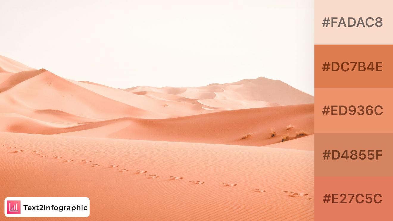
The warm and sandy tones in this palette reflect the beauty of desert landscapes. These colors are great for brands looking to convey warmth and subtle energy. This palette can be used in travel or wellness infographics to evoke a sense of calm and exploration.
10. Golden Highlands
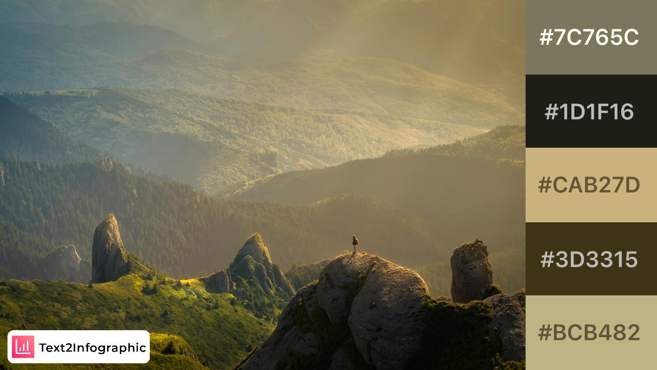
Inspired by highland terrains bathed in golden light, this palette blends warm golds and deep browns, perfect for rustic or outdoor-themed projects. The rich, earthy tones give a grounded feel, making it ideal for eco-friendly branding or natural product packaging.
11. Herbal Garden
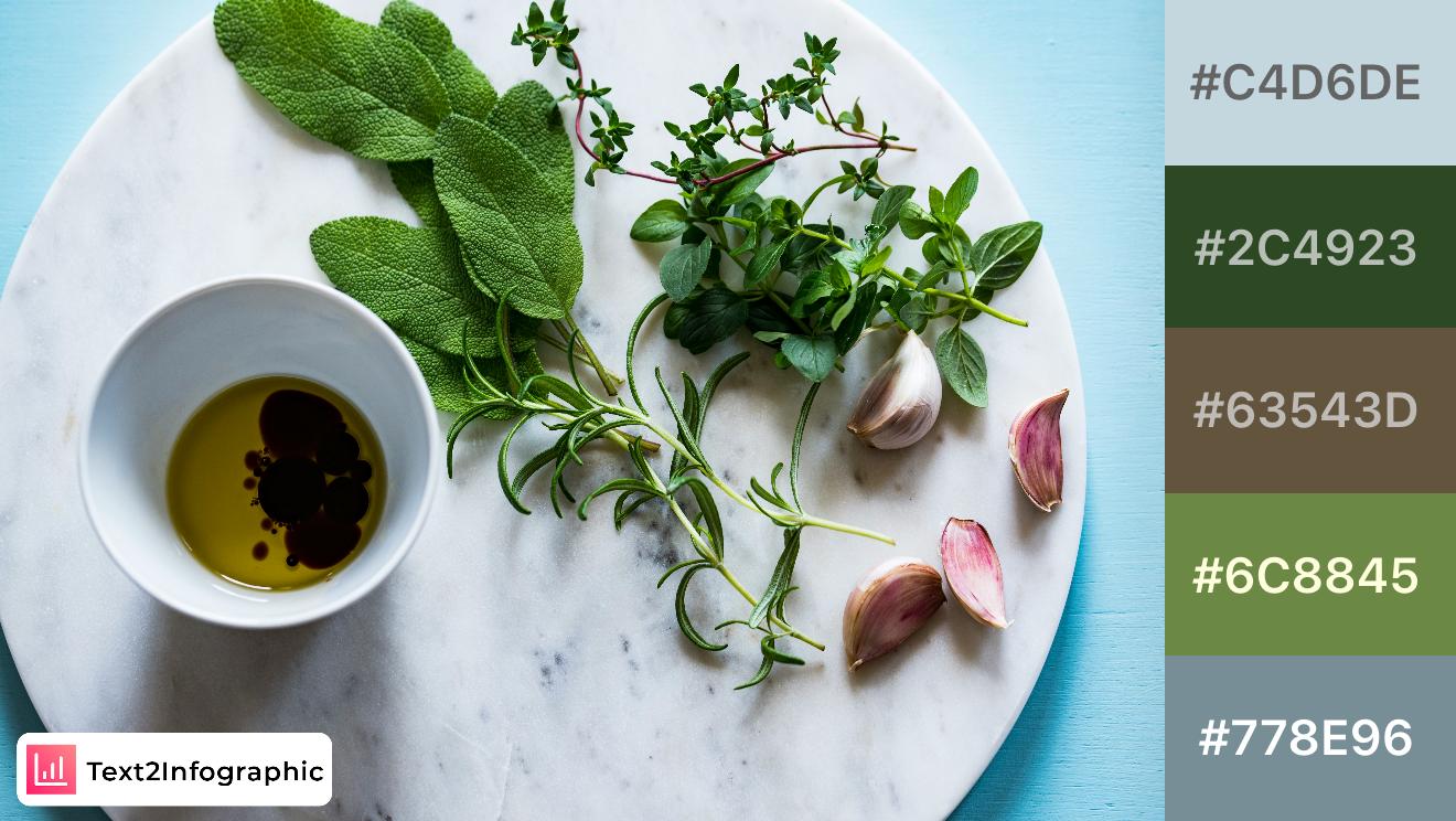
Inspired by fresh herbs and natural textures, this palette combines cool greens and earthy neutrals. Ideal for wellness, organic, or eco-friendly branding, these shades evoke a sense of freshness and health, making them perfect for visuals focused on nature and sustainability.
12. Tropical Brunch
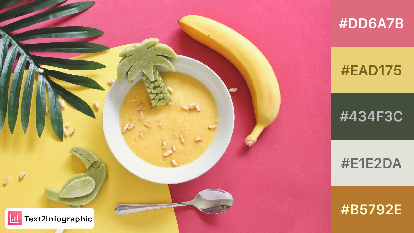
Bright and playful, this palette captures the vibrant colors of a tropical brunch setting. The warm pink and yellow evoke a fun, energetic feel, perfect for food or lifestyle brands that aim to capture a cheerful atmosphere. This palette is ideal for designs needing a lively touch.
13. Rustic Garlic
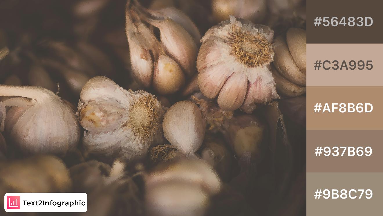
This warm, earthy palette draws inspiration from the natural hues of garlic bulbs. Perfect for brands focused on organic, artisanal, or culinary themes, these tones evoke a sense of warmth and authenticity. The muted browns and beiges make this palette versatile for food-related infographics and branding.
14. Farm Fresh
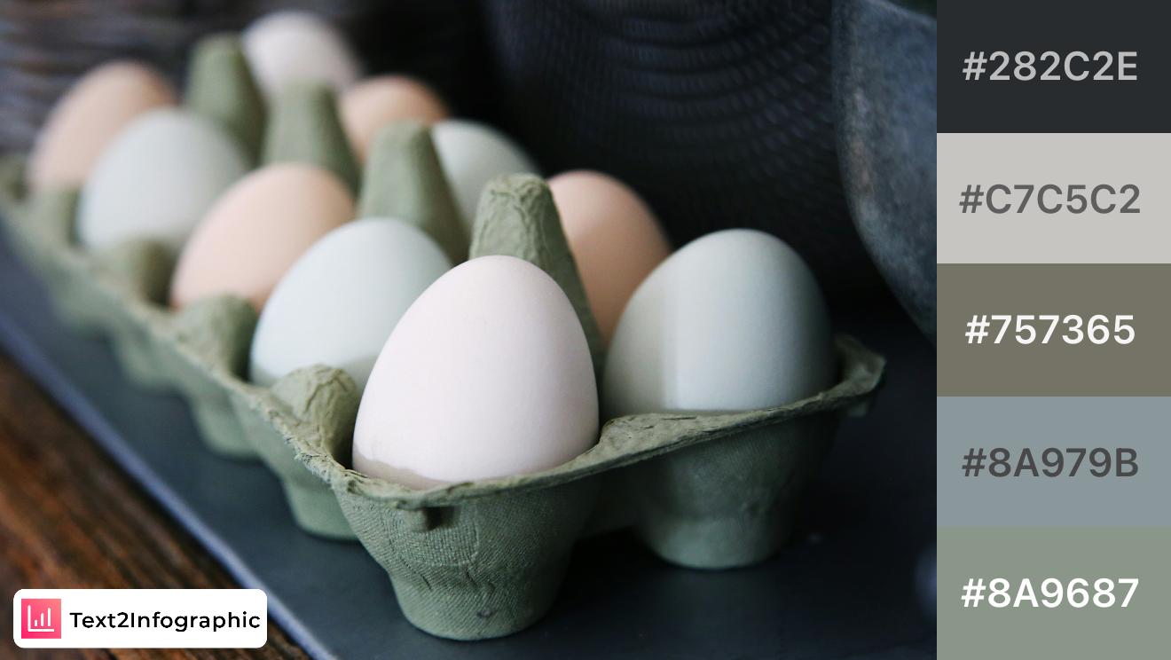
Inspired by the soft, muted hues of fresh eggs in a carton, this palette evokes a rustic, organic feel. The gentle grays and greens are ideal for brands that emphasize simplicity and natural ingredients, making this a great choice for minimalist, farm-to-table branding.
15. Rustic Donuts
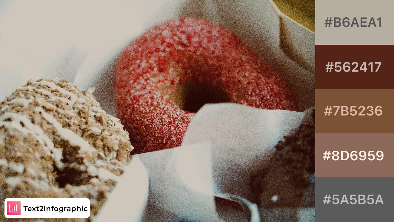
With warm, inviting tones inspired by freshly baked donuts, this palette blends soft beiges and browns. Ideal for artisan bakeries or cozy brands, these colors create a comforting, nostalgic feel, making it a great fit for branding that celebrates homemade or crafted products.
16. Garden Harvest
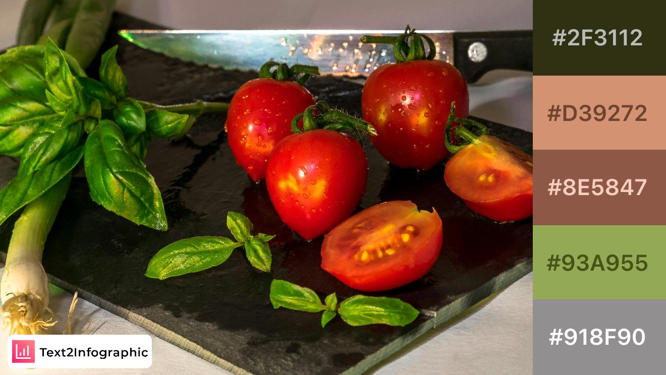
This palette captures the rich colors of a fresh garden harvest with earthy greens and vibrant reds. Perfect for culinary brands, it adds a touch of freshness and vitality, ideal for conveying the essence of organic ingredients and farm-to-table concepts.
17. Vineyard Greens
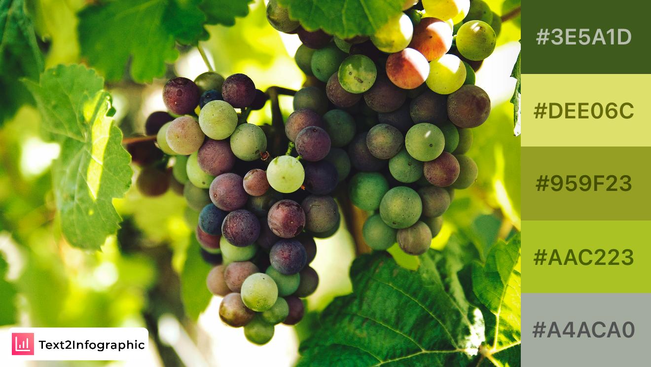
Inspired by a fresh vineyard, this palette captures the transition of grape colors from green to purple. With vibrant and earthy greens, it's ideal for brands that emphasize natural, fresh, or organic themes. Great for adding a lively, fertile feel to any project.
18. Autumn Grapes
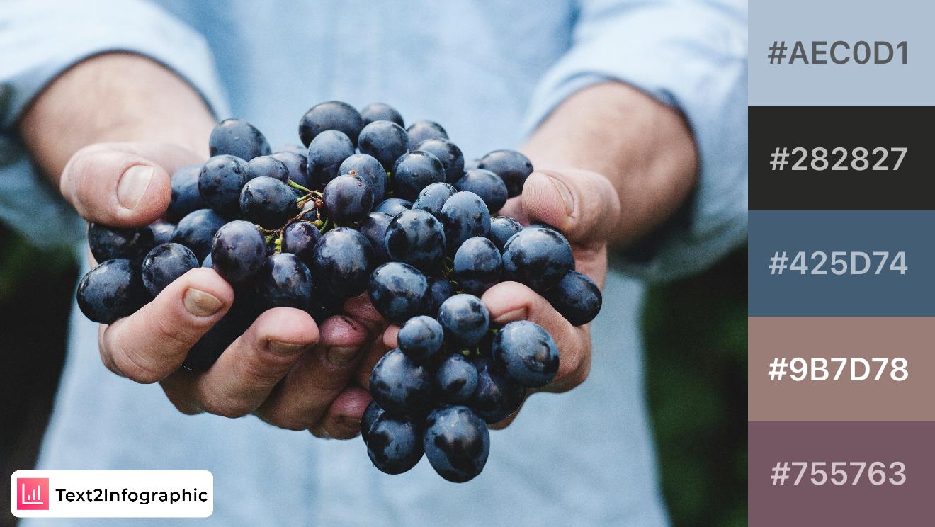
Drawing from the deep purples and cool grays of freshly picked grapes, this palette adds a sophisticated, earthy touch. Perfect for wine or luxury brands, the combination of cool and warm tones gives a refined yet organic feel.
19. Apple Orchard
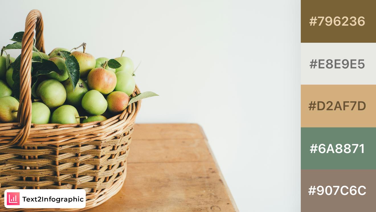
With warm greens and soft browns, this palette brings the cozy feel of an apple orchard to life. Ideal for earthy and nature-inspired brands, the colors provide a grounded, wholesome look, perfect for agricultural and sustainable themes.
20. Rustic Citrus
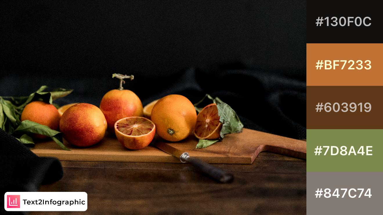
This rich palette combines deep oranges and greens, reminiscent of a rustic citrus display. Perfect for artisanal food brands or designs that evoke warmth and richness, these colors add a sense of handcrafted quality and natural charm.
21. Mystic Waves
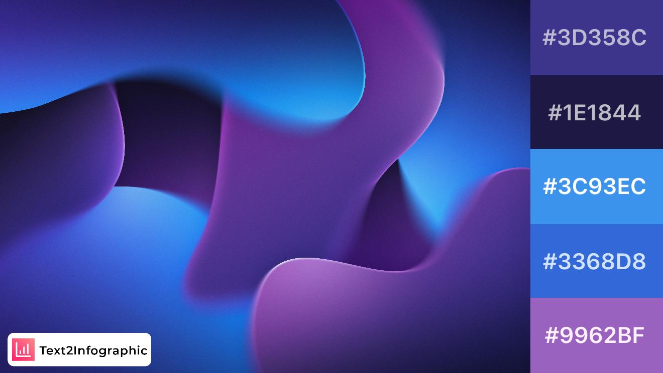
This palette captures the fluid and mysterious vibes of deep ocean waves with touches of twilight sky. The rich purples and deep blues evoke a sense of calm, while the pop of lighter blue adds freshness. Perfect for tech brands aiming for a modern, approachable look or for infographics focused on innovation, as the combination balances boldness with serenity.
22. Electric Pink
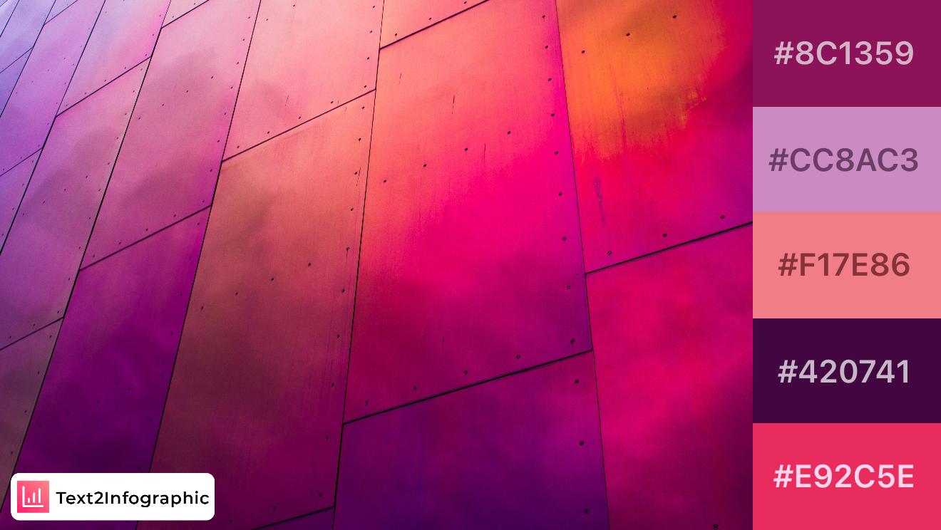
Vibrant and edgy, this palette mixes bold pinks and purples with dark undertones, capturing a sense of urban nightlife or modern pop art. Perfect for brands that want to stand out and make a strong impression, it’s great for youth-focused marketing or infographics that aim to grab attention with bold visuals. The contrasting tones add depth and dynamism.
23. Earthy Tones
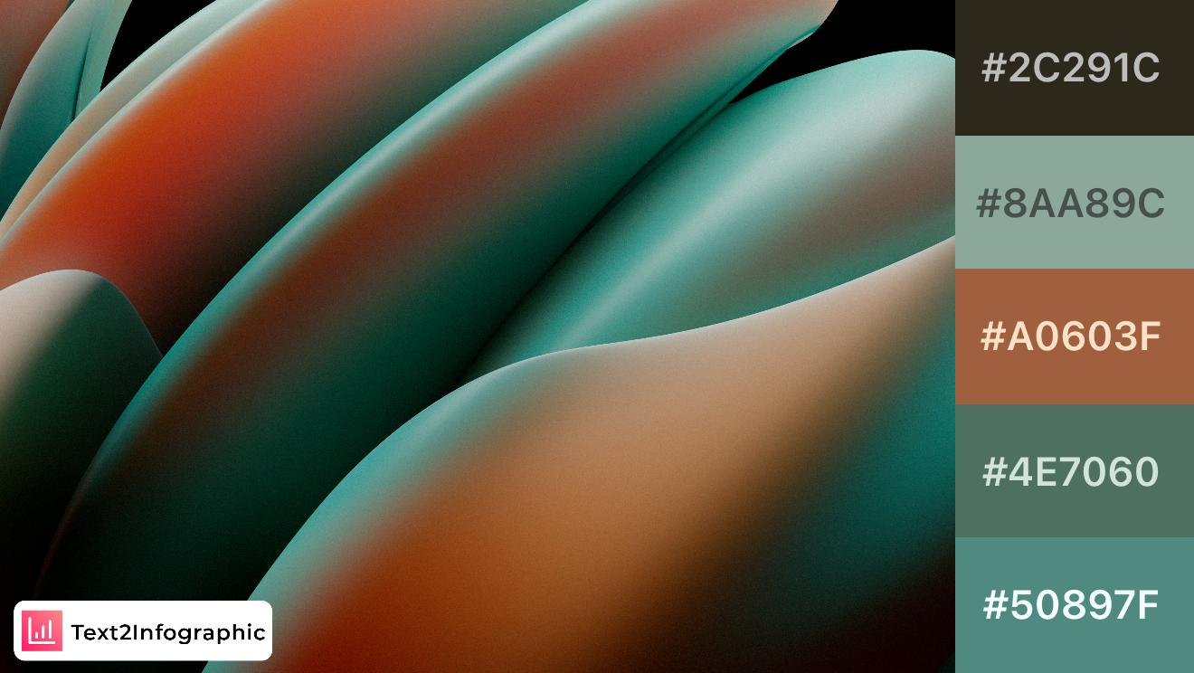
Inspired by natural foliage and earthy shades, this palette combines muted greens and browns to evoke a grounded, organic feel. Ideal for eco-friendly brands or infographics on sustainability, the colors harmonize well and provide a sense of stability. Use it to create a warm, natural aesthetic that resonates with environmental themes.
24. Sunset Glow
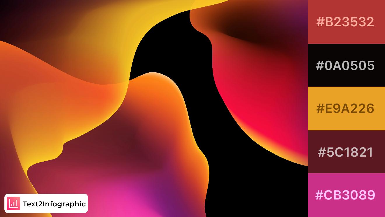
This bold and warm palette takes inspiration from a vibrant sunset, with intense reds, oranges, and pinks. Ideal for fashion, beauty, or any brand looking to make a powerful statement, the contrast between dark and bright colors creates a dynamic energy. Great for infographics where you want to highlight key points or add a warm, engaging feel.
25. Soft Breeze
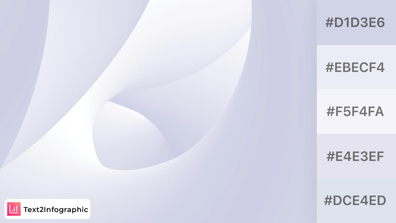
Soft and airy, this palette brings a calm and tranquil atmosphere, reminiscent of a cloudy sky. The subtle gradations of light gray and blue hues make it ideal for minimalistic design, branding for wellness or lifestyle, or backgrounds in infographics where clarity and cleanliness are key. It’s versatile and understated, perfect for conveying simplicity and calm.
26. Neon Industrial
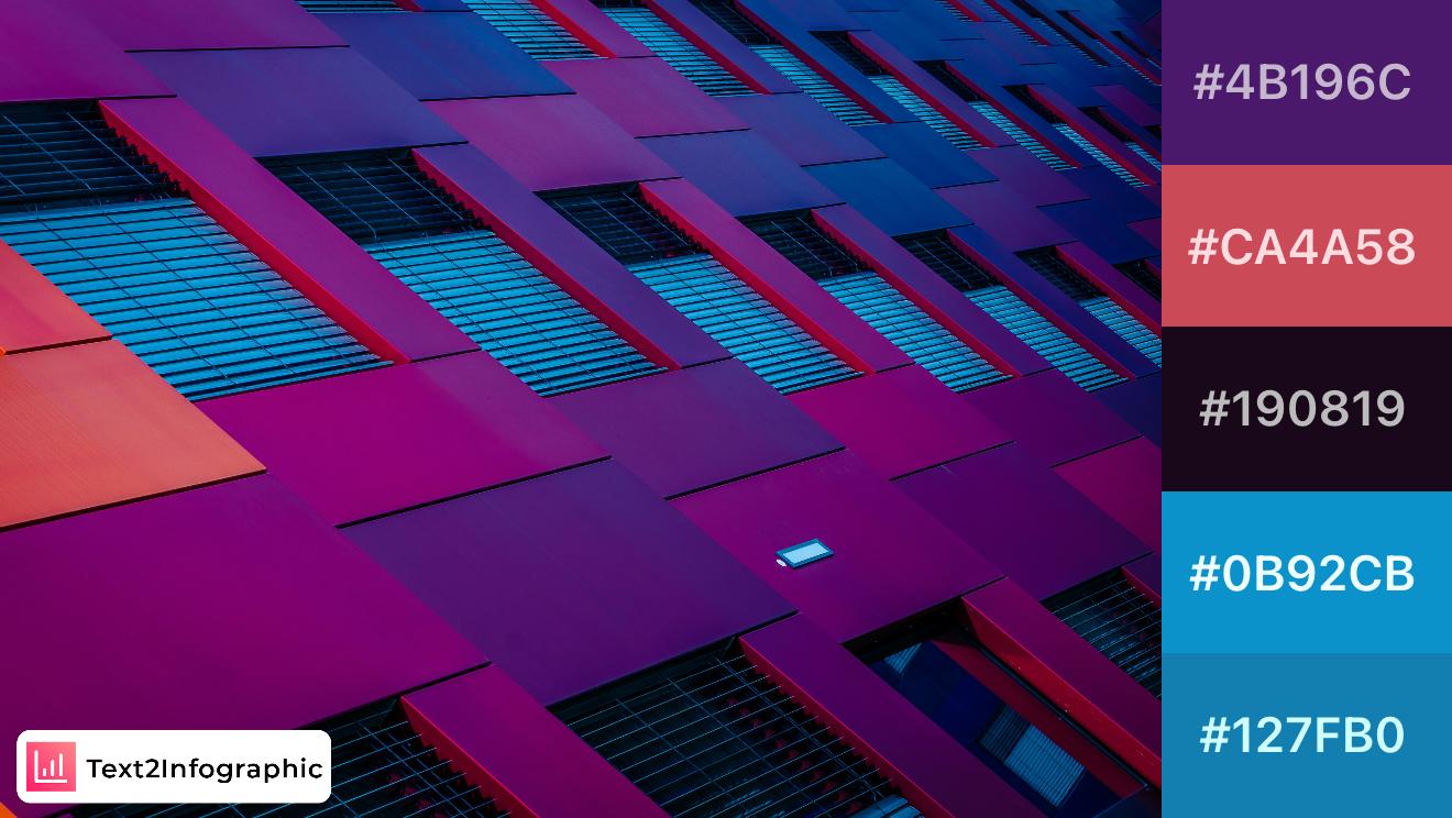
Inspired by the bold architecture of urban facades, this palette combines vibrant reds and deep blues with a solid black. Ideal for designs that aim to stand out, the colors evoke a sense of edgy modernism. Use the darker shades to add depth and structure, while the brighter tones bring in an unexpected pop of color.
27. Velvet Depths
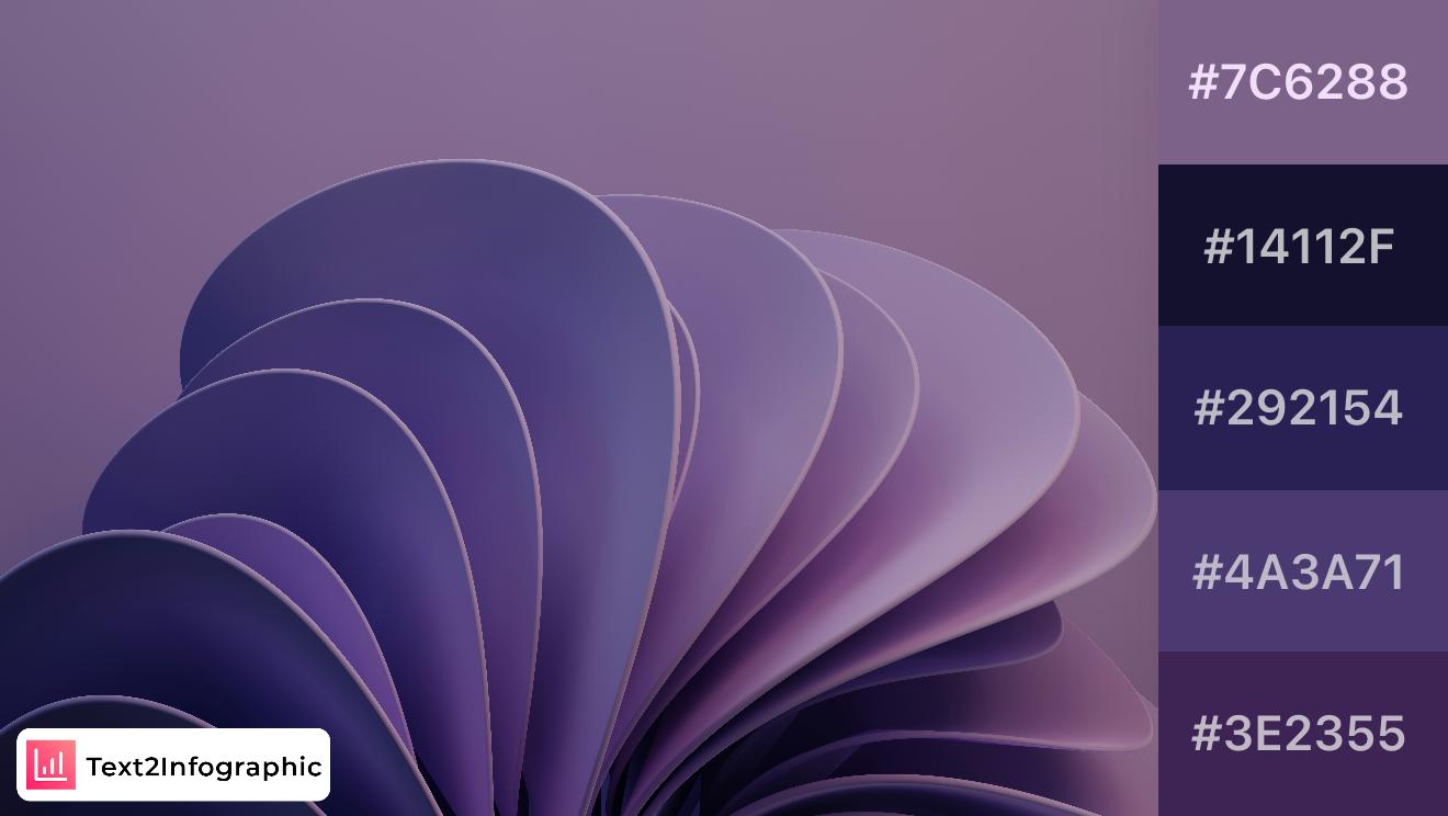
Rich purples and deep blues give this palette a luxurious, velvety feel. Perfect for designs aiming for elegance or mystery, these colors create a sense of depth. Combine with metallic accents for a refined, high-end look.
28. Lavender Twist
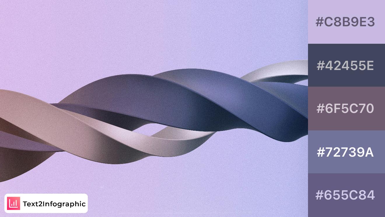
A gentle blend of lavender and gray tones, this palette is serene and elegant. It works well in calming designs or for creating a sophisticated aesthetic. Use the lighter colors as backgrounds, while the darker tones add subtle contrast.
29. Golden Horizon
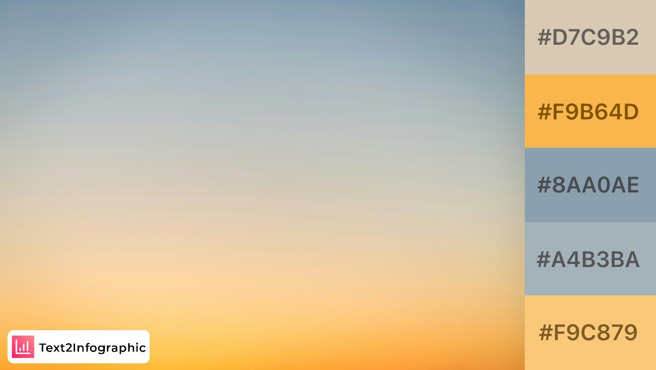
Inspired by the calmness of dawn, this palette captures soft beiges and light blues with warm golden tones. Ideal for soothing, minimalist designs, it’s perfect for backgrounds or branding that requires a calm and inviting appeal.
30. Tropical Sunset
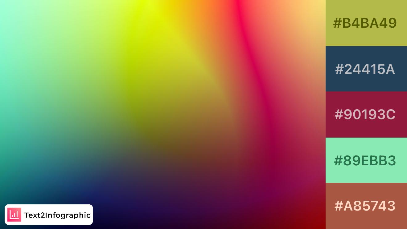
This palette channels the warmth of a tropical sunset with a blend of olive green, deep blue, and vibrant red. Perfect for projects needing a warm, organic feel, the colors offer a lively contrast. Pair the greens with the reds for a lush, balanced design.
5. Additional Design Tips for Creating Impactful Infographics
Creating an infographic that truly resonates with your audience goes beyond just picking a few colors. This section provides key design tips to help you optimize your color choices for accessibility, balance vibrant and neutral tones, and refine your design through testing and feedback.
5.1 Optimizing Color Choices for Accessibility
When designing infographics, accessibility is a crucial factor to consider. Ensuring that your color choices are readable for all audiences, including those with color vision deficiencies, will help your content reach a wider audience. Here are a few ways to make your infographic colors more accessible:
- Choose High-Contrast Color Combinations: High contrast between text and background colors improves readability for everyone, especially those with limited vision. Dark text on a light background (or vice versa) is often the easiest to read.
- Avoid Relying Solely on Color to Convey Meaning: Use color as a supportive tool rather than the main form of communication. For example, instead of just using color to distinguish categories in a chart, add labels or icons to make it easy to understand for all viewers.
- Check for Color Vision Deficiency Compatibility: Tools like Adobe Color’s accessibility checker or the Contrast Checker by WebAIM allow you to test your color combinations for color blindness and overall accessibility compliance. This is particularly helpful for ensuring your design communicates effectively to everyone.
Optimizing for accessibility not only broadens your infographic’s audience but also strengthens its clarity and effectiveness. When your design is easy to interpret, it becomes more impactful and memorable.
5.2 Best Practices for Balancing Color in Infographics
A well-designed infographic balances vibrant colors with neutral tones, creating a professional and visually appealing look. Here are some tips to help you achieve this balance:
- Use Neutral Colors as a Foundation: Incorporating shades of gray, beige, or white as background colors or in non-essential elements helps frame your infographic while letting the main colors stand out. Neutrals provide a calm backdrop that keeps your design from feeling overwhelming.
- Add Color for Emphasis, Not Overload: Vibrant colors are great for drawing attention to key points, but they can easily overpower a design if overused. Apply bold colors sparingly to emphasize important sections or data points. This keeps the focus on the content rather than distracting the viewer with excessive color.
- Create a Visual Hierarchy with Color: Use different shades and intensities to create a visual hierarchy. For example, brighter colors can be used for headings and key statistics, while softer tones are ideal for supporting details. This approach guides the reader’s eye through the content in a natural and organized way.
A balanced use of color enhances readability and helps convey information more effectively, ensuring that each element of your infographic works together harmoniously.
5.3 Testing and Getting Feedback on Color Choices
No matter how skilled you are at designing infographics, testing your color choices and gathering feedback is essential. This step allows you to catch any potential issues and make adjustments to ensure your design communicates as intended.
- Preview Your Infographic on Different Devices: Colors can appear differently on various screens due to differences in brightness, contrast, and color calibration. Testing your design on multiple devices—such as a desktop monitor, laptop, tablet, and smartphone—helps ensure that your color choices look consistent across platforms.
- Seek Feedback from Others: A fresh set of eyes can provide valuable insights. Share your design with colleagues or target audience members to get their thoughts on readability, color contrast, and overall appeal. Ask specific questions about what stands out to them or if they found any areas difficult to read.
- Use Heatmaps and User Testing Tools: For digital infographics intended for websites or social media, heatmaps can reveal how viewers interact with your design. Tools like Crazy Egg or Hotjar show where people focus their attention, helping you identify if your color choices guide viewers’ eyes effectively.
Incorporating feedback and testing your design ensures that your infographic not only looks appealing but also communicates your message clearly. With these additional design tips in mind, you’re well-equipped to create impactful, accessible, and visually balanced infographics that leave a lasting impression on your audience.
By following these best practices, you’ll be able to make thoughtful color choices that not only enhance your infographics but also improve your overall content strategy.
Ready to Create Stunning Infographics?
Try these features to transform your content into engaging visuals: